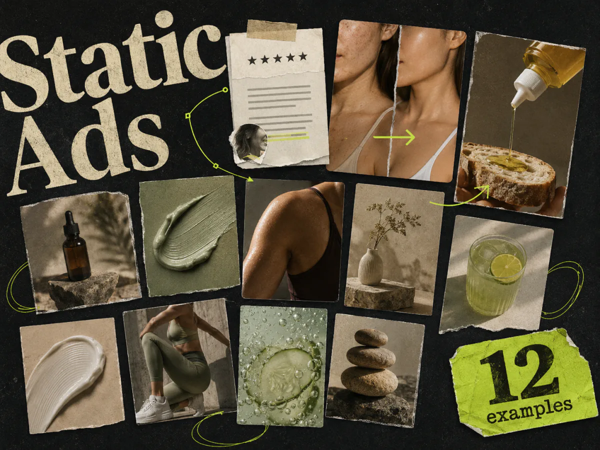
Most Facebook static ad example roundups are just walls of screenshots. You scroll, think "that looks nice," and leave with no idea what to make.
This one has a narrower job. We picked 12 ads with a clear strategic move, then broke down the part worth testing: the hook, proof, visual hierarchy, or angle.
One caveat before we start: we do not have account data for every ad below. A screenshot cannot tell you whether an ad was profitable. I would rather call these useful examples than pretend every good-looking ad is a winner.
TL;DR
The best Facebook static ads make one idea easy to understand. Some lead with a customer quote. Others use a before-and-after, a blunt problem, a product mechanism, or a simple comparison. The layout changes, but the useful ones give your eye somewhere obvious to start.
| Example type | What makes it useful | What to test next |
|---|---|---|
| Review over product | Adds proof without hiding the product | Specific quote versus star rating |
| Benefit stack | Explains several reasons to buy in one scan | Benefit order |
| Native social post | Feels closer to feed content than a designed ad | Post format versus polished layout |
| Before-and-after | Makes the promised change visible | Image choice and timeframe |
| Customer note | Turns a review into the whole creative idea | Handwritten versus typed treatment |
| Product demonstration | Shows the product doing its job | Demonstration angle |
| Objection-led | Opens with a frustration the buyer recognizes | Exact wording of the objection |
| Text story | Lets the customer experience carry the ad | First line and level of detail |
| Mechanism-led | Explains why the product should work | Mechanism versus outcome hook |
| Founder or creator POV | Gives the claim a face and point of view | Person, quote, and setting |
1. Put the review where people can actually see it

This phone-case ad does not make the review a tiny footer. The quote sits across the product and takes up roughly a third of the image.
That is a smart trade. The case is still obvious, but the customer gives you the reason to care: it looks good without ruining an outfit. The wording is casual enough to sound like a person, not packaging copy.
The weak spot is the generic five-star row. It adds familiarity, but the quote is doing the real work.
What I would test:
- A shorter version of the quote
- The same layout with one concrete product detail
- A product close-up without the stars
The lesson is not "put stars on everything." It is that proof needs enough room to be read.
2. Build a benefit stack around one main promise

"Comfort That Lasts" is the first thing you see. Everything below it explains why the claim might be true.
The ad covers cushioning, materials, washability, fit, and purpose. That is a lot of information, but it stays readable because the headline does not compete with those details. The product photo gets the other half of the canvas.
This format works best when buyers ask several practical questions before purchasing. Shoes are a good fit. So are supplements, skincare, household products, and software with a specific use case.
I would test the order of the benefits before redesigning the whole ad. The first two rows will get more attention than the last two, so they should answer the biggest objections.
3. Make the ad look like the content around it

This fragrance ad looks like a social post someone might have stopped to read anyway. The story starts with a dating problem, moves into the product, and ends with a specific outcome.
The design is almost beside the point. A profile line, a block of text, and a product photo are enough. That is exactly why it works as a creative pattern. It does not announce itself as an ad before the reader has a chance to get interested.
The risk is obvious: fake-native ads can feel painfully fake. The voice has to match the person supposedly posting it. "Text chemistry was great, but in person... zero spark" is more believable than a paragraph of polished brand language.
Test the opening sentence. If the first two lines do not pull the reader in, the rest of the story never gets read.
4. Use before-and-after only when the difference is visible

Before-and-after is one of the oldest direct-response formats because it compresses the argument into a glance. This skincare ad also shows the products underneath, so the viewer does not have to guess what caused the change.
There is a lot happening here: two faces, a product range, small benefit icons, a headline, and a CTA. The ad gets away with it because the before-and-after owns the top half.
If the images were less clear, the whole thing would become a pink product grid with too much copy.
What to borrow:
- Make the contrast the biggest object
- Put the product close to the result
- Keep secondary claims genuinely secondary
Do not manufacture a dramatic "before" image. Apart from the trust problem, beauty and health claims need careful review against Meta's policies and the evidence you actually have.
5. Turn the review into an object

The review here is not placed inside a standard testimonial card. It looks like a note taped into a scrapbook.
That choice gives the ad texture. It also fits the quote, which is specific and low-key: no irritation, fresh feeling, subtle smell. The design would feel mismatched with an aggressive discount or a miraculous claim.
This is a good reminder that proof has a format. A clinical statistic should look clinical. A casual customer note can look personal and imperfect.
The next test is not a different background color. Try the same quote as:
- 1.A screenshot of a real review
- 2.A clean product-page card
- 3.A plain text post with no decorative treatment
The test is whether the presentation feels credible. The words stay the same.
6. Show the product doing the interesting thing

The headline says the product is "made to squeeze," and the photo immediately proves it. You understand the packaging difference before reading the small label.
This is a product demonstration squeezed into one frame. It is much stronger than a bottle standing on a kitchen counter because the image explains the feature.
Look for the small action that makes your product satisfying:
- A lid clicking into place
- A stain lifting from fabric
- A dashboard turning messy data into one chart
- A product fitting into a space where the old one did not
For this ad, I would test the same squeeze shot with an outcome-led headline. The image can stay. The angle changes from product feature to cooking convenience.
7. Open with the sentence your customer keeps saying

"Still recording 5 times?" is not elegant copy. Good. It sounds like the complaint that caused someone to search for a solution.
The phone conversation on the left supplies context. The right side gives the answer and a few product benefits. The eye moves in the correct order without much effort.
This pattern is useful for products that replace repetitive work. The best hook may already exist in:
- Support tickets
- Sales calls
- Reddit threads
- Customer interviews
- Reviews of competing products
I would test the exact number. "Recording 5 times" feels concrete, but a different audience may respond better to "Still re-recording every mistake?" Specificity helps only when it feels true.
8. Make the comparison visible, not theoretical

The promise is "Same idea. 10x more conversions." I would be careful with that number unless it is backed by evidence, but the visual structure is useful.
The left side shows the rough input. The right side shows the polished output. You can understand the job of the product without reading a feature list.
For a less claim-heavy version, the headline could describe the transformation directly:
Turn a rough landing page into a test-ready variant.
The useful part is the contrast. Show what the buyer has now and what they get after using the product. Do not make them imagine the difference from a paragraph.
9. Let a short customer story carry the ad

This ad is mostly text on a bright background. There is nowhere for weak copy to hide.
The first line gives us the old state: eight hours of sleep, still exhausted. The rest follows a simple week and ends with a change in the afternoon routine. Whether the product can support every implied claim needs evidence, but the storytelling structure is solid.
What makes it readable is the progression. Monday through Friday gives the text a shape. Without that device, it would be a dense testimonial in the middle of a pink square.
Try this pattern when the customer's routine matters more than the packaging. Keep the story short enough to scan on a phone.
10. Explain the mechanism without writing a science essay

"This isn't a mystery multivitamin" is a useful hook because it creates a question. What makes the product less mysterious?
The three callouts answer it: nutrient gaps, clinical backing, and traceable origins. The bottle stays central, but the ingredient explanation is the reason to believe.
Mechanism-led ads are useful when every competitor promises the same result. "More energy" is easy to copy. A distinct formulation, process, material, or workflow gives the buyer something more concrete to compare.
The trap is adding every technical detail you have. Pick the one mechanism that supports the main outcome, then link through to the full explanation.
11. Use contrast to sell the desired state

This cookware ad sells the feeling of an organized kitchen. The product is present, but the real contrast is "cluttered and hard to find" versus "organized and easy to love."
That gives the ad a wider emotional angle than durability or non-stick performance. It is still concrete. Anyone with a chaotic cupboard can recognize the scene.
The useful test here is angle, not layout:
- Organization
- Cooking performance
- Easy cleaning
- Space saving
- A coordinated kitchen
Keep the images and change the reason to care. That tells you more than making five color variations of the same organization ad.
12. Give the claim a face

"I thought greens powders were a scam. I was wrong." The line works because it starts from resistance instead of instant enthusiasm.
The person, product, and quote all fit into one frame. There is no need for a long biography. We understand the role immediately: this is someone who did not expect to like the category.
Skeptic-to-customer stories are useful in crowded markets because they acknowledge the objection rather than talking past it. They also fail quickly when the person feels random or the quote sounds scripted.
Test different sources of skepticism. Price, taste, setup time, category fatigue, and previous bad experiences can each lead to a different ad.
What these examples have in common
The layouts are different, but most of them answer four questions quickly:
- 1.What am I looking at?
- 2.Why should I care?
- 3.Why should I believe this?
- 4.What should I do next?
Not every ad needs a visible CTA button. Not every ad needs a testimonial. But when the viewer has to hunt for the main idea, the designer has already made the media buyer's job harder.
The other pattern is restraint. The strongest examples above commit to one angle. The shoe ad is about lasting comfort. The olive oil ad is about the squeeze bottle. The cupboard ad is about organization. None of them tries to cover the full product page.
How to turn an example into a useful test
Saving the image is the easy part. The useful work is separating the strategy from the decoration.
Take one reference and write down:
- The audience problem
- The angle
- The hook
- The proof
- The visual device
- The CTA
Then decide which part you actually want to borrow.
If you like the olive oil ad, you may not need a green background or condensed type. The useful idea could be "show the packaging feature in action." For your product, that might become a close-up of a spill-proof cap or a one-click export.
Change one strategic variable at a time. A clean first test might keep the same product, offer, proof, and layout while changing the hook. The next round can keep the winning hook and test a different visual.
Our creative testing framework goes deeper into how to set that up.
Borrow the pattern, not the brand
Competitor research gets uncomfortable when "inspiration" becomes tracing.
You can borrow a broad advertising pattern. Review ads, comparisons, before-and-afters, founder stories, and benefit stacks are not owned by one brand. You should not copy another company's photography, logo, wording, distinctive composition, or customer claims.
A simple check helps:
If someone placed both ads side by side, would yours look like the same campaign?
If the answer is yes, you have not adapted the idea far enough.
Use the reference to identify why the ad communicates well. Then rebuild that logic with your own product, proof, voice, images, and offer. We covered the line in more detail in clone versus copy.
Where Adrio fits
Adrio is built for the step after research. You can search competitor ads, save the patterns that matter, and turn a reference into editable static variants for your own brand.
The useful part is not cloning a finished image pixel for pixel. It is carrying over the structure, then changing the angle, copy, product shots, colors, and proof until the ad belongs to your campaign.
You can also export the result in 1:1, 4:5, and 9:16 instead of rebuilding the same idea three times. If you want the full research process first, start with our guide to finding competitor ads in the Meta Ad Library.
FAQ
What is a Facebook static ad? A Facebook static ad uses one still image rather than video or animation. It can run in Facebook and Instagram feeds, Stories, Reels placements, Marketplace, and other eligible Meta placements.
What makes a good Facebook static ad? A good static ad makes one idea clear quickly. The viewer should understand the product, the reason to care, and the next step without reading a paragraph of small text.
Where can I find Facebook static ad examples? Start with the free Meta Ad Library. Search direct competitors and larger brands in your category, then look for ads that have stayed active or appear in several variations. Ad research tools can make that process faster.
Can I copy a competitor's Facebook ad? You can learn from common patterns, but do not copy a competitor's assets, wording, logo, customer claims, or distinctive layout. Rebuild the strategy with your own brand and evidence.
How many static ads should I test? Start with a small set of genuinely different concepts rather than many cosmetic variations. Four to six ads around one offer is enough for an initial read in many accounts, though the right number depends on budget and conversion volume.
Should a Facebook static ad be square or vertical? Prepare 4:5 for feed, 9:16 for full-screen placements, and 1:1 for square-safe coverage. Keep the hook and proof consistent while adapting the composition to each crop.